Primary Bookkeeping
Branding and Web Design for a bookkeeping startup.
↓
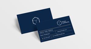
This client came to me to help them get their bookkeeping business of the ground. She wanted a clean and modern logo that represented her main reason for starting the company: to spend more time with her son. The brief was to use only primary colors in the palette, incorporate simple geometric shapes, and stay within established styles of other bookkeeping services. The final logo is based on a child's building block, while the arrowheads represent the financial cycle.
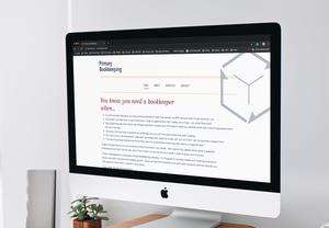
I did the overall branding, including logo design, business cards, letterhead, and invoice design. I also designed the webpage, and did a photoshoot for the client to use as unique content.
Web
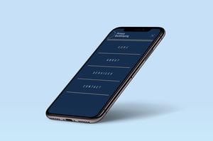
The website maintains a conversational tone throughout, providing a lighter personality than other, more conservative bookkeepers. The format is cleanly laid out, and is easily expandable for any changing needs the client may have.
Branding
Photography
The client wanted something a little more personal than typical stock photos, so we shot a series of her working with her own tools.


